
Evolution of Mitsubishi’s Three-Diamond Logo
Before there was Mitsubishi Motors, before the auto brand even expanded past the island of Japan, Mitsubishi was a shipbuilding company. Beginning in the 1850s, Mitsubishi didn’t create products for dry land until the 1920s, and that was after they branched out into an electric company that designed Mitsubishi’s first-ever automobile, the Mitsubishi Model A in 1917. It’s been a century since that first car, and like most automobile companies, Mitsubishi has weathered many storms. However, its unmistakable logo has stayed true throughout as a sign of strength and sustainability.
100 Years in the Making
2017 is the centennial anniversary of Mitsubishi Motors – a huge accomplishment for any company. We covered their history earlier this year, “Celebrating 100 Years of Mitsubishi Motors.” 100 years may surprise some of you – Mitsubishi cars were actually sold under the Chrysler and Dodge name in the 1970s for a decade. In 1982 they broke into the American Market and made a lot of noise when the company went to the race track with their Galant Vr-4.
Mitsubishi Logo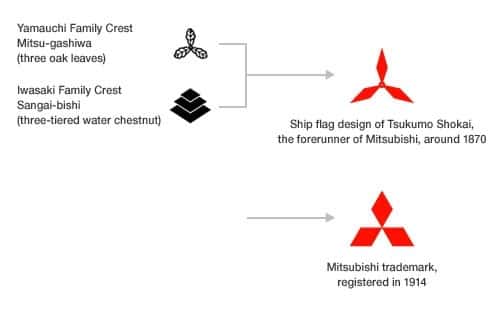
So where did the logo start? Well, that brings us to the shipping company, Tsukumo Shokai, founded by Yataro Iwasaki. To form the icon, found on many of the ship’s flags, was a combination of Iwasaki’s three-layer chestnut family crest and the three-leaved oak of the Yamanouchi family, from the Tosa Clan (his first employer). As you can see from the picture to the right, it looked more like turbines or propellers, than three diamonds meeting in the center.
In 1964, the logo took a new shape to build a familiar corporate image among consumers. It turned from diamonds into rhombi, still meeting in the center, but with the bottom two almost forming a sort of foundation for the top, pointing upward. The three rhombi stand for the values of Mitsubishi Motors: integrity, success and reliability.
![]()
Would you believe the name “Mitsubishi” came after the logo? Derived from the Japanese terms “Mitsu” and “Hishi”, the two were combined for the automakers name today. “Mitsu” means three, and “Hishi” means water chestnut. When “Hishi” is the middle or latter part of a word, it is pronounced “Bishi”, hence “Mitsubishi”. We can also see how the family crests played a role in the logo given these terms.
Known in over 140 nations, Mitsubishi can be recognized on a global scale by the three red rhombi. It’s amazing how a few shapes can become the symbol for 100 years, and many more to come.